
Chart Shape
The Chart shape visualizes data as line plots, scatter plots, or combined views with regression curves and outlier markers.
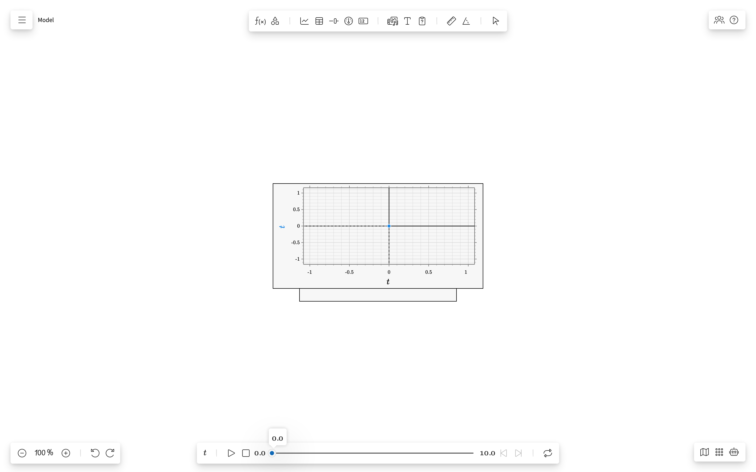
Overview
A Chart shape plots one or more data series from your model. It supports computed series (from expressions), data series (from table data columns), and regression overlay curves. Outlier points are visually marked to aid data interpretation.
Toolbar
The Chart toolbar provides:
- Series picker — Choose which terms to plot on X and Y axes
- Add series — Add another Y-axis series to the chart
- Axis configuration — Set axis labels, ranges, and scaling
- Color picker — Change shape accent color
- Delete — Remove the chart from the board
Series Types
| Type | Source | Appearance |
|---|---|---|
| Computed | Expression terms evaluated at each iteration | Continuous line |
| Data | User-entered values from a Table data column | Scatter points |
| Regression | Curve from a regression term | Smooth fitted line |
Terms With Text Values
A term restricted to a set of labels — z \in \{green, blue, red\} — has no numeric scale to be plotted against, so a chart of such a term counts instead: one column per label, as tall as the number of iterations that held it. The horizontal axis carries the labels and the vertical axis carries whole counts, so the X-axis term is not used. Bars and lines both draw the counts.
Displaying Regression Curves
After performing a regression in a Table shape:
- The regression term becomes available in the chart series picker
- Add the regression term as a Y-axis series
- The fitted curve overlays on the original scatter data
- Compare the model prediction with the experimental data visually
Outlier Visualization
The chart automatically detects and marks outlier points when a regression is active:
- Normal data points are shown as filled circles
- Outlier points are marked with a distinct style (different color or shape)
- The detection uses the
isOutlierIterationmethod from the calculation engine - Outliers are determined by their distance from the regression curve
Axis Configuration
| Option | Description |
|---|---|
| X-axis term | Which term provides X values (default: independent variable) |
| Y-axis terms | One or more terms plotted vertically |
| Auto range | Automatically scale axes to fit all data |
| Manual range | Set specific min/max for each axis |
| Scale | Whether a value stands where its size puts it or where its logarithm does, Linear or Log, for the vertical axis. A logarithmic axis spreads its decades evenly and numbers them 1, 10, 100, is stretched a decade at a time by pulling one of its numbers, and given no positive end starts at 1, since nothing below zero has a logarithm |
| Axis labels | Custom labels displayed on each axis |
Properties Panel
| Property | Description |
|---|---|
| Series list | All series currently plotted, with their axis assignments |
| Grid lines | Show/hide background grid |
| Legend | Show/hide the series legend |
| Point markers | Show/hide individual data point markers |